Greatly honored to be asked to succeed Dave Campbell as the new secretary of the news and general juries for the upcoming World Press Photo judging in February in Amsterdam. I got my feet wet in the role for the multi-media judging last year. That jury lasted a week, the upcoming main judging spans two weeks. Going to need to do a lot of stretching!
A few images form the beach this year. I spend most of my time painting (gallery here), but still love to shoot when the time is right.
National Geographic photographer Cotton Coulson died in Norway the last week of May, after a scuba diving accident. (nppa.org)
When I first entered close orbit around planet National Geographic in the late 1980s, Cotton Coulson happened to be on a path to the outer apogee of his own NG life. We only met from time to time, socially, usually in association with his wife, NG photographer Sisse Brimberg. He was a curious person, who spewed all manner of ideas about photography and publishing in an aggressive style that I initially found off-putting. He seemed to be talking to me in a manner that said “you don’t get it, do you?”
I didn’t actively avoid Cotton, but I also was not particularly attracted to his slightly mocking approach. I indeed did not get it: I did not get him.
This would change. Years later, I married NG photo editor Kathy Moran, and began the usual pair-bonding process of melding our various friends. Kathy and Sisse were close—and Cotton came with the package. This was around the beginning of the last decade, and at the time Sisse and Cotton were in California, where Cotton worked for CNET. I had recently decamped from NG for U.S.News & World Report, where we had just missed each other (Cotton had been Associate Director of Photography and I came in as Creative Director). The fact that we both had distanced ourselves from NG became a first layer of glue applied between us.
Since we lived quite a distance apart (we would never live in the same area, alas) we did not see each other that often. But when we did meet up, we would get absorbed in all manner of topics around publishing, technology, photography and art.
That was one of the things I admired about Cotton: he never fell into a predictable professional career path. When I first met him back in '80s he was actually selling insurance to photographers. Photographer-Insurance Salesman, now there was a unique combo. But in the ensuing years he would pursue different challenges at U.S.News, The Baltimore Sun, CNET, along with his own photography and film making. And he was a passionate source of information on whatever technology or digital publishing platform was hot.
Then I made my own odd career move, becoming Director of Photography at National Geographic magazine. It was a curious shift for me since I had marked the center of my career as a graphic designer (with a passion for photojournalism and publishing technology). I was honored to be in this position, but I was also struggling with the complexity and mixed embrace from those I oversaw. My time as DOP was fraught to say the least. And when Cotton and I were together, he was a significant help as I sorted through the struggles I was enduring.
Over time I discovered that his overly aggressive approach turned out to be something much different. When Cotton questioned you, it was not—as I had felt when we first met—to challenge your knowledge or sensabilities; it was to push you. And his advice, more often than not, was to support making a change, to take a risk. I sensed that Cotton abhorred those who embraced the status quo or sought shelter away from the turmoil that always accompanied making leaps of faith. When cracks appeared, while some might try to seal them, Cotton pried them wider—and then slipped through. His ability to see opportunity in the chaos became a major inspiration.
We would see each other more often as Kathy and I increased traveling, usually adding a day or two to a business trip when we were near he and Sisse. We even travelled together on a Lindblad tour of Antarctica. But the trip that would leave the most significant, personal impact on me about Cotton, was during a true vacation to Tuscany.
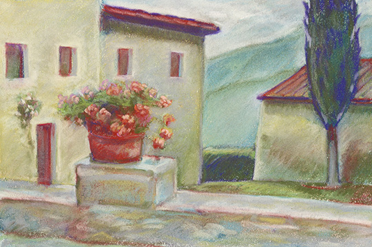
Cotton, along with being so many things, had also been an abstract painter. I have drawn and painted most of my life, so we had something—which had nothing to do with journalism—to bond over. (Disappointingly, I never did get to see his work before he destroyed all his canvases. I only learned of this after his death, so never had a chance to question him on it.)
My work is mostly landscape, and so on our trip to Italy, I naturally made a number of drawings as we toured about. One day I was sketching in the courtyard of the house we had rented north of Sienna, when Cotton walked up and looked over my shoulder. I tend to be shy when I’m working, so I figured this was as good as any moment to stop. But then Cotton leaned forward and, with his unique blend of goading and upbeat tone, simply said: “Keep going.”
Really? OK. So I did one more pass over the drawing as Cotton walked off to take make photographs. And, indeed the final pastel was better, more refined. Continuing was absolutely the right move.
And ever since, whenever I find myself at such junctions, where I need to decide if I should stop or continue, I hear Cotton’s two words pushing me to take another swipe at the canvas.
But here’s the thing, his encouraging advice is more than just about art, it is a broader approach to life itself, embodied by someone for whom stopping was the worst possible choice anyone could make.
And so it is why the sudden loss of Cotton is such a shock—I never imagined a world where he was not out there learning something, reinventing himself, or exploring a new place. Cotton was the one that I assumed all along would always, just simply, keep going.
Excited to be working with editor Lisa Moore and the staff to help "refresh" the current design of National Wildlife, to premier with the 2016 issue (published in December, 2015) celebrating NW Federation's 80th anniversary. Already have begun the process with them, getting enlivened input from the staff on new features and approaches.
Q&A with editor Victoria Pope. Link here. It was interesting that NYT chose not to show the cover, opting to use one of the images from our regular feature where we pick a single Instagram shooter to highlight for each issue. Well, here is the cover.
Helping Dan Chung with a refresh of his branding, plus ongoing consult on the design of the website as they begin to update over the next few months. Here's the new design.
This huge cherry tree, a block away, can be seen from our second floor rear window of our home in Arlington, VA. It is always the first sign that winter has finally departed, but only lasts about a week.
Under the imposing roofline of the new wing of the Stedelijk Museum. New entrance (under construction) to the Van Gogh Museum in lower left.
I will be working with editor Victoria Pope in helping to create a new quarterly publication. Prototyping now, with first edition aimed for Spring launch. Fantastic to be working on a totally new publication. Stay tuned for when it is more officially announced and I can share the design.
Had a great angle on Central Park as the weather changed. Plus funky building reflections near Wall Street.
Renée's photographs from her book will be exhibited at the Viewpoint Photographic Art Center in Sacramento from Feb. 11 to Mar. 7, 2015.
Link to the gallery's details here.
Memorial Bridge from the Virginia side.
Renee Byer's book, which I had the honor of designing, won first place Documentary book in the 2014 International Photography Awards. Link here.
My son, Kyle, and I were hiking in Yosemite on July 26 and encountered the obscured view from Inspiration Point (where Ansel Adams made his icon image of "Clearing Winter Storm"). Our view was a tad less clear.
One image I shot was published in The Post's National section.
July 30 in The Washington Post, Book World section
"You may not know of Peter Mendelsund by name, but if you are a book lover, you have seen his work. He is an accomplished designer of book covers at the Knopf publishing house. He created the cover of Stieg Larsson’s “The Girl with the Dragon Tattoo,” with its faded image of a dragon weaving through the title; the smart repetition of the title on the cover of James Gleick’s “The Information;” and the stately use of typography and image on James Salter’s “All That Is,” to name just a few. And now he has written two books of his own. One of them left me slouched in my chair, but the other had me jumping for joy."
Cool and an honor to be among such colleagues.
Or paste this link
http://www.featureshoot.com/2014/04/101-photo-industry-professionals-follow-twitter/?tru=FhKiI#disqus_thread&utm_source=hootsuite&utm_campaign=hootsuite
Last weekend The Post published a selection of my Antarctica photographs in the Sunday Travel section. Since TWP is a multi-channel publisher the article appeared here, with an associated and extended photo gallery.
I have been experimenting with the new visual narrative sharing application Storehouse. The most impressive aspects of this iPad program are the tools for very simply building a story with words and pictures. If you only look at what others have made, you are missing the greatest part--story creation.
I was later pleasantly surprised when the SH team contacted me and asked if they could use one of my images for the splash screen (which they plan to rotate). When they sent me a link, the image looked soft, so I asked them if I could submit a high res and they kindly agreed. That kind of attention to detail bodes well for this group.
On top of all of this, I just got the word that Jenna Pirog has been hired as their editorial director. Jenna, along with Andrew Owen, had been managing the Look3 photography festival in Charlottesville, VA until they decided to decamp, without any solid prospects, for San Fran. They are young, energetic and wanted to take a stab at the left coast scene. Andrew landed as events director for Instagram, and now Jenna at SH. These visual companies have secured two great voices in the photographic community.
I have reviewed many portfolios, often looking for emerging talent. Each editor is different, these are my tips.
1. It’s not just about the photographs. It’s also about you. Editors are looking closely at how you carry yourself, how engaged you are, inquisitive, articulate, calm, etc. They’re trying to get a sense for how you might act in the field as a journalist and representative of the publication, and how you might conduct yourself with their colleagues (editors, designers, technicians, etc.). Your work shows if you have the skills, while your demeanor predicts how you will fit within the publication’s culture.
2. Know my publication. At a minimum, read the latest edition. It leaves a good impression if, when the moment feels right, you comment on a recent story you like. Or, you might be asked what you thought of a recent story. In that case, be honest! (Most editors have a high-minded self-view, so it doesn’t hurt if they get knocked from their perch.)
3. Show variety. If you are early in your career and editors don’t expect you to have a singular style. In fact they may prefer to see that you can be a jack-of-all trades. Never assume they are looking for only one specific type of photography—they might see something unexpected that they need.
4. Purge your weakest work. Your portfolio is defined by your best work, but it might be dismissed for the worst. Hence, you should constantly strive to replace the poorest images from your portfolio. Don’t have great portraits or landscape? Go out and shoot a ton until you get worthy replacements.
5. Your portfolio should be self-explanatory. Do not yack away explaining each image, unless you are asked to do so. If you have a photo story, add a title with a one sentence explainer. (This will also provide a window into how you handle captions, a vital aspect of all photojournalism.) Do not expect a busy editor to read a five paragraph overview with the lame title “Photo Story #1.” And never, ever make excuses for why something could have been better.
6. Keep your portfolio simple in design. Choose a background which visually recedes: if it is a Blurb-like book, keep everything on white; if it is on a screen, present on black. Avoid white or black bordered edges on your photos. Do not overlap your photos. For books, strive for one photo per page with finger room around each. For digital displays, maximize the size.
7. No gimmicks. Heavy Photoshop, de-saturation, HDR? Get out of journalism, go to art school. Don’t waste an editor’s time. Most want to see images that show the human condition, not what technique is the latest rage.
8. Do not expect an assignment. At National Geographic, I reviewed many folios knowing it might be years before a photographer distinguished themselves to the point of garnering an assignment. Your review is often just the first date of what could be a long relationship.
9. Be guided by the comments. An editor’s comments are usually in context of the specific needs of their publication. You might be a great photographer, but you also might not be the right photographer for their needs. If the review does not go well, do not see it as failure, see it as a helpful road sign leading to another publication where you are better suited and appreciated.
10. Exit gracefully. Always have a card to leave that has your contact information. Each editor is different, but if I was interested I would ask you to stay in touch. Do so by sending an occasional, brief(!) email or mailer that has a link to your latest work. Remind the editor where you met, since they most likely will not remember. Say “thank you” no matter how the review may have gone.
Good luck