Washington Post weather page
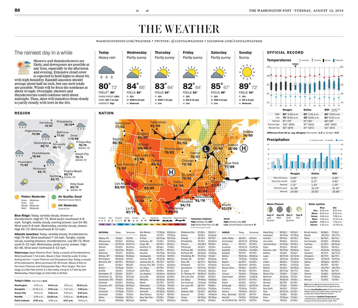
When I started at The Post, my wife declared that I could now fix the weather page, which as a long-time reader, drove me crazy. It took three years: mission accomplished.
Seriously, a page of this kind involves painstaking minutia and ultimately is very tricky since, like puzzles and comics, readers do not take kindly to change, even if it is well-intentioned. After launch The Post received the expected rants, but ultimately some very solid critical suggestions, which were taken to heart and incorporated into later versions.
The designers and programers at AccuWeather were instrumental in bringing our comps to reality. The live page is composed automatically each evening.
Client: The Washington Post with AccuWeather
Role: Design
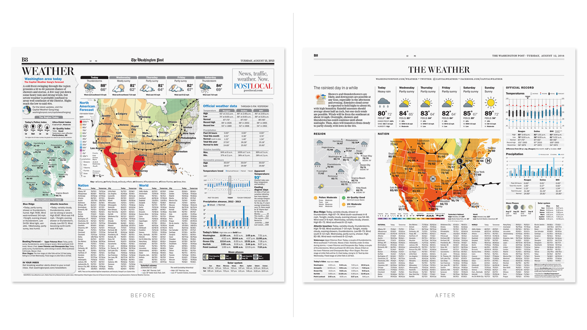
THE REWORK OF ONE CHART
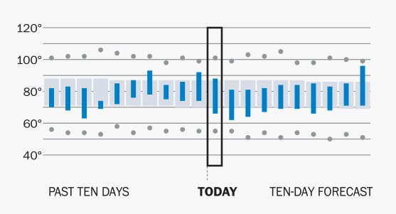
Original design
One change to the page, the long range temperature chart, proved particularly challenging to improve and keep as easy to understand as possible. The first attempt was a fail with readers, so we iterated to arrive at what was much better received. Below are most of the versions we explored.

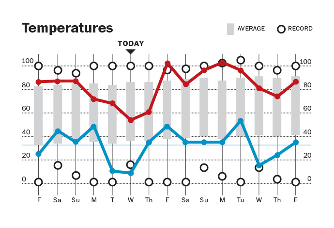
The first published redesign of the temperature chart. Reader feedback found it too confusing and the red to blue gradient did not reproduce well (was too often out of register).
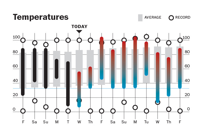
Iteration A
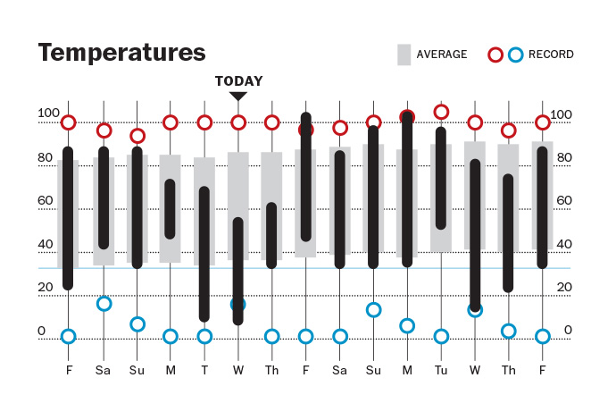
Iteration B: graphing the highs and lows, but the logic on this was too confusing.

Iteration C: too hard to read the average gray bars below the fever line.
Iteration D: much simpler
Iteration E: closer

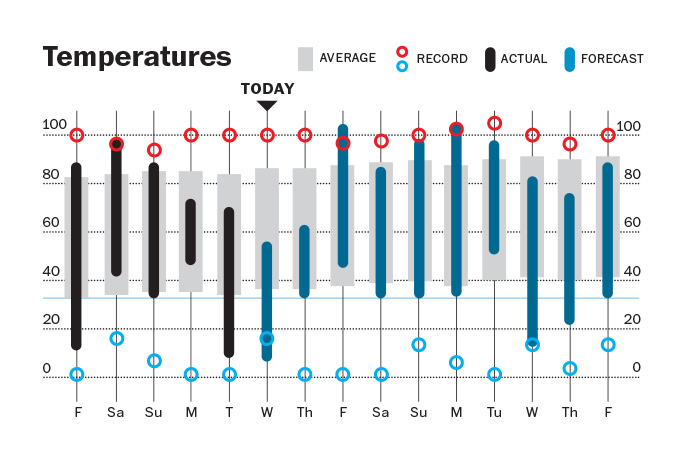
Final rework